

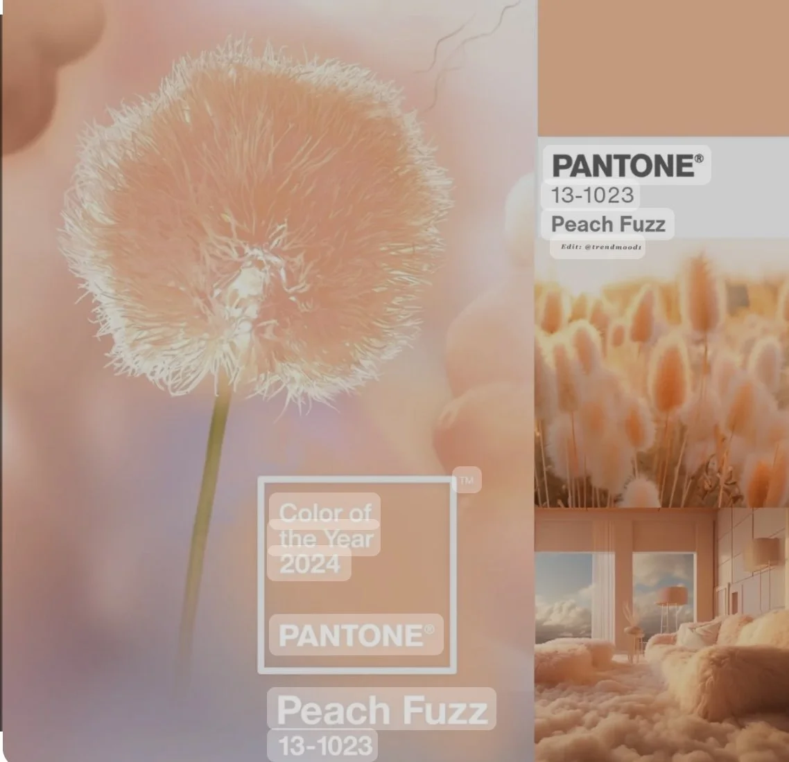
Pantone Colour of the Year 2024 : Peach Fuzz
Pantone have announced their colour of the year as:
Pantone 13-1023 Peach Fuzz…..we are here for it!
The soft, heartfelt hue expresses the desire to nurture kindness compassion and connection. We believe it will work perfectly on our glass whiteboard.
Our glass whiteboard can be made and finished in our range of 24 colour or match bespoke to a RAL / Dulux Colour of your choice to evolve in to your office space and company vision.
Selecting colours for your glass wipe boards and office space involves considering various factors, including the nature of work, desired ambiance, and personal preferences. Here are steps to help you choose colours for your office:
1. Consider the Nature of Work:
Productivity: For a dynamic environment, consider energising colours like blues, greens, or yellows that can enhance focus and productivity.
Creativity: If creativity is crucial, opt for stimulating colours like reds or oranges that can inspire innovative thinking.
Serene Environment: For a more tranquil atmosphere, choose calming colours for your glass whiteboards like soft blues, greens, or neutrals for a relaxed work setting.
We have colours in our range called:
Stone Cement, Barley There and Mossy Bank that can all bring that calm to your workspace.
www.glasswhiteboardco.com/glass-whiteboard-colours
2. Assess Space and Lighting:
Natural Light: Consider how natural light affects colour perception. Lighter colours can make a smaller space feel larger, while darker tones can add warmth and coziness.
Space Size: Lighter shades can create an illusion of space, while darker hues can make a large space feel more intimate.
3. Understand Colour Psychology:
Blue: Promotes calmness, focus, and productivity.
Green: Evokes feelings of balance, growth, and freshness.
Yellow: Enhances positivity, energy, and creativity.
Red: Stimulates excitement, energy, and urgency.
Neutral Tones (Grey, Beige): Offer a sense of sophistication, neutrality, and versatility.
4. Complement Branding and Culture:
A popular choice within our customer base is to align the colour scheme of your glass whiteboards with your brand's identity and values. Use brand colours or tones that reflect your company's ethos and branding visuals to create a cohesive environment.
5. Test Samples and Combinations:
Experiment with paint samples or colour swatches on the walls to see how they look in the office space. Consider colour combinations to create visual interest and balance.
6. Focus on Balance and Accents:
Balance bold colours with neutrals to avoid overwhelming the space. Use accent colours strategically for your glass whiteboards, furniture, accessories, or artwork to add pops of color without overpowering the room.
7. Employee Preferences and Well-being:
Consider employee preferences and well-being. Involve your team in the decision-making process to ensure a welcoming and comfortable work environment.
8. Future Adaptability:
Choose colours that have longevity and can adapt to potential changes in the office setup or design trends, our glass whiteboards each come with a 25 year guarantee so choosing something that is timeless is a great choice to keep them in line with any future workspace changes.
Conclusion:
Choosing colours for your glass white boards and office space is a decision that can influence the atmosphere and productivity. By considering the nature of work, lighting, color psychology, brand identity, and employee well-being, you can create a vibrant, comfortable, and conducive workspace that aligns with your company's culture and goals.
Request our Glass Whiteboard Collective’s colour swatch :
Sales@gwbcollective.com